


MEDIA & PARTNERS / BRAND STANDARDS
ONE BADGE.
ONE FESTIVAL.
The ScaffFest identity, from the first logo placement to the final print file.
VERSION 1.0 · OCTOBER 2026 · 58 PAGES
01 / THE LOGO FAMILY
THREE WAYS TO SAY SCAFFFEST.
01 / PRIMARY BADGE
The main event identity. Use it on posters, merchandise and prominent festival placements.
02 / SECONDARY LOGO
The full name for wider spaces, including headers, banners and partner layouts.
03 / COMPACT MARK
The three F forms for small spaces, icons and supporting details.
02 / THE COLOUR SYSTEM
RED IS THE SIGNAL.
CREAM IS THE AIR.
NEAR-BLACK
#111111 · Primary field
WARM CREAM
#F4F0E6 · Editorial space
FESTIVAL RED
#E2382B · Action + emphasis
FESTIVAL
Food / music / camping
#F6B51B
CHAMPIONSHIPS
Crews / skill / design
#E2382B
IDEAS + EXPO
Talks / tech / partners
#6B8E6A
MEDIA
Stories / podcast / news
#7156A5
Use topic accents for navigation and campaigns. Keep reading copy on near-black, cream or white.
03 / TYPE THAT DOES THE WORK
BUILT FOR
THE TRADE.
BARLOW CONDENSED BOLD
CLEAR DETAILS.
EASY TO READ.
Use Manrope Regular and Bold for website body copy, names, dates and practical information. Keep Barlow Condensed Bold for the headlines.
Aa Bb Cc / 0123456789
Social and campaign graphics use Barlow Condensed Bold throughout.
04 / FROM THE BOOK
SEE THE SYSTEM IN USE.
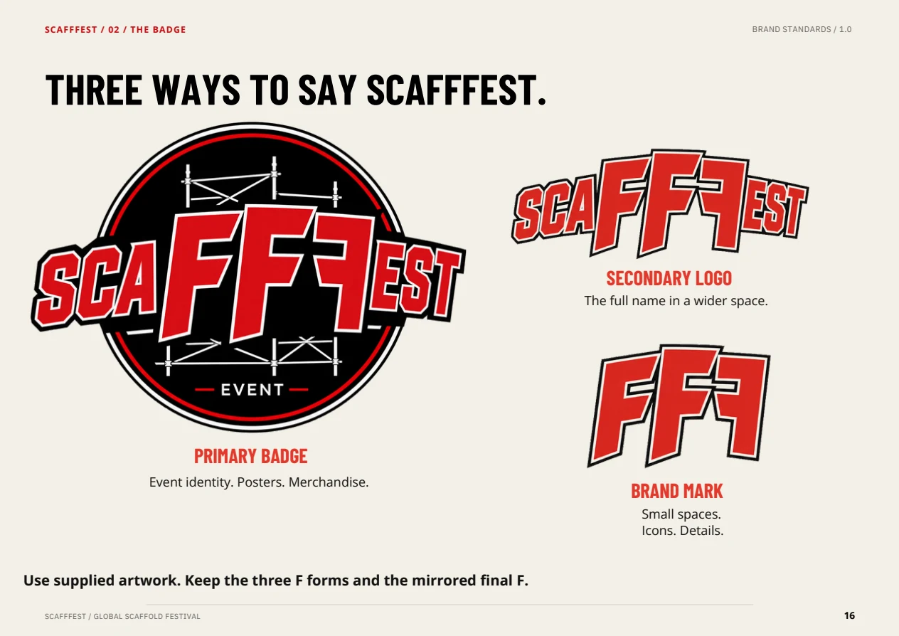
16 / The logo family
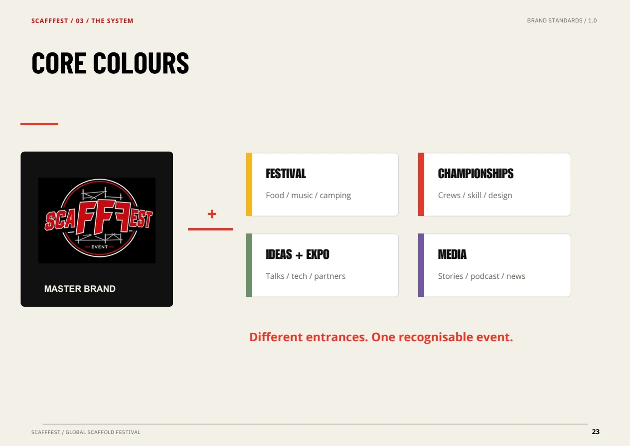
23 / Colour by subject
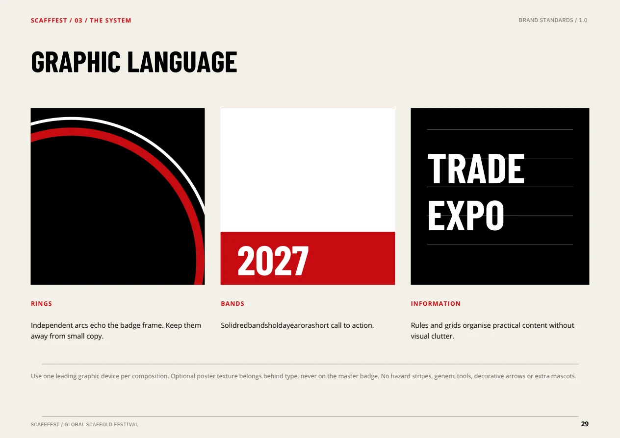
29 / Graphic language